Dyslexia Fonts - Do they Work?
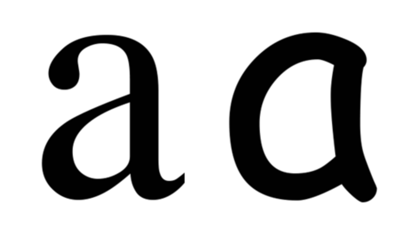
Directional confusion between similar letters is known to affect children with dyslexia. Anecdotal reports suggest that children with dyslexia may find it more difficult to recognise certain fonts or visually similar letters such as b-d, or numbers, 6-9. The representation of the letter 'a' is different in the font Times New Roman when compared to Comic Sans. Is one font easier to read than another?
There are several typefaces that have been specifically created to help people with dyslexia by increasing the readability of text. The two most well-known are OpenDyslexic and Dyslexie. However, there is no reliable research evidence that special fonts for children with dyslexia have any beneficial effect.
Peer reviewed research studies have found no improvement when children were using the OpenDyslexic or Dyslexie fonts. One study did find that it was helpful for children to read text which had increased spacing.
Research Study Extract: Influence of increased letter spacing and font type on the reading ability of dyslexic children (2018) (1)
“Recent research studies have shown that increased letter spacing has a positive effect on the reading ability of dyslexic individuals. This study aims to investigate the effect of spacing on the readability of different fonts for children with and without dyslexia. Results did not support the hypothesis of better performance among children with dyslexia when reading text in Dyslexie than in other fonts. However, they revealed that only spacing plays a role in enhancing dyslexic individuals’ reading performance because Dyslexie and the Times New Roman interspaced font have no difference. Furthermore, the negative effect of the unfriendly fonts Times New Roman Italic and Curlz MT was eliminated through increased interletter spacing.”
Research Study Extract: Dyslexie font does not benefit reading in children with or without dyslexia (2017) (2)

"In Experiment 1, children with dyslexia (n = 170) did not read text written in Dyslexie font faster or more accurately than in Arial font. The majority preferred reading in Arial and preference was not related to reading performance. In Experiment 2, children with (n = 102) and without dyslexia (n = 45) read word lists in three different font types (Dyslexie, Arial, Times New Roman). Words written in Dyslexie font were not read faster or more accurately. Moreover, participants showed a preference for the fonts Arial and Times New Roman rather than Dyslexie, and again, preference was not related to reading performance. These experiments clearly justify the conclusion that the Dyslexie font neither benefits nor impedes the reading process of children with and without dyslexia."
Research Study Extract: The effect of a specialized dyslexia font, OpenDyslexic, on reading rate and accuracy (2016) (3)
"Results from this alternating treatment experiment show no improvement in reading rate or accuracy for individual students with dyslexia, as well as the group as a whole. While some students commented that the font was “new” or “different,” none of the participants reported preferring to read material presented in that font. These results indicate there may be no benefit for translating print materials to this font."
It was once believed that dyslexia was a visual processing problem, but Science of Reading research has proven that dyslexia is a language-based disorder. Some fonts are easier to read than others, but this is an issue which is not specific to dyslexia, the readability of a font affects all children.
Citations: